Quick answer
Packed slides hurt your message. Keep one idea per slide, use large high-contrast text, set styles once in the Slide Master, limit motion, and simplify charts. Practice with Presenter View and Speaker Coach, test the real projector, run the Accessibility Checker, embed fonts and carry a backup PDF.
Key takeaways
- • Give every slide one headline message and move long explanations into the speaker notes
- • Microsoft recommends 18pt or larger sans serif text and strong contrast for readable slides
- • Set fonts, colors and logos once in the Slide Master so group decks stay consistent
- • Presenter View shows your notes, the next slide and a timer while the audience sees only the slide
- • Pick 16:9 or 4:3 early and test the deck on the actual projector before the day
- • Embed fonts, run the Accessibility Checker and carry a backup PDF in two places
Table of contents 18 sections
- Why Does More Text Feel Like More Effort?
- Mistake 2: Text the Back Row Cannot Read
- Fonts That Are Too Small
- Low Contrast Between Text and Background
- Mistake 3: A New Look on Every Slide
- Mistakes 4 and 5: Motion and Charts That Distract
- Mistake 4: Animations and Transitions Everywhere
- Mistake 5: Charts Nobody Can Read
- Mistake 6: Slides With No Map
- Is Reading Off Your Slides Really So Bad?
- Mistakes 8 and 9: Checks You Skipped
- Mistake 8: Never Testing on the Real Projector
- Mistake 9: Forgetting Accessibility
- Mistake 10: Arriving With One Fragile File
- PowerPoint Presentation Mistakes at a Glance
- A Simple Prep Workflow Before Presentation Day
- Where Office Automation Training Fits In
- Start With Your Next Deck's Title Slide
Many students believe a packed deck proves hard work, yet most PowerPoint presentation mistakes start with exactly that belief. A panel or a manager judges your thinking, and crowded slides hide it. Fewer words, clearer visuals and a tested file show far more effort than 40 slides of pasted paragraphs.
Here is what this article covers:
- The 10 slide habits that quietly weaken university talks, FYP defenses and office reports
- What each one looks like from the audience's seats
- Real PowerPoint features that fix them, checked against Microsoft's own help pages
- A one-page table you can keep open while you edit
- A short prep routine for the days before you present
Why Does More Text Feel Like More Effort?
When you paste a full paragraph onto a slide, it feels safe. Everything you know is there, so nothing can be forgotten. The problem is that your audience can either read or listen, and they cannot do both well at the same time.
Among all PowerPoint presentation mistakes, the first and most common is treating the slide as your script. In a viva or FYP defense, examiners start reading the wall of text and stop hearing you. In an office meeting, your manager skims ahead and asks questions about slide 9 while you are still on slide 4.
The fix is a simple rule. Give each slide one clear message, written as a short headline. Support it with a few points or one visual. Move the long explanation into the speaker notes box under the slide, where only you can see it.
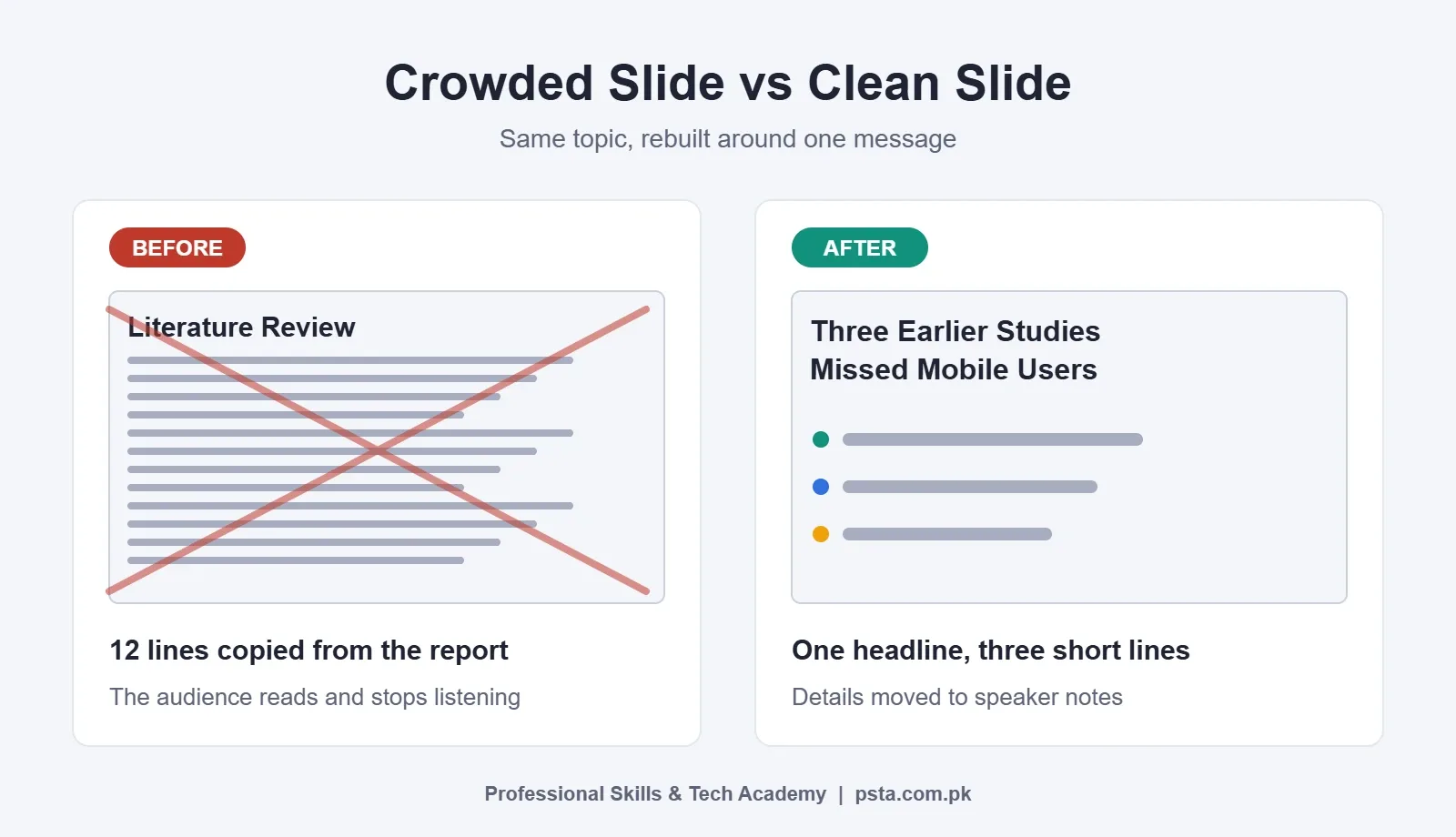
Here is an example. A crowded slide titled "Literature Review" holds 12 lines copied from your report. A cleaner version is titled "Three Earlier Studies Missed Mobile Users," with three short lines and the citations in your notes.
Mistake 2: Text the Back Row Cannot Read
Some PowerPoint presentation mistakes only show up in a big room. A slide that looks fine on your laptop can be unreadable from the last row of a lecture hall. Two problems usually cause this: font size and contrast.
Fonts That Are Too Small
Microsoft's guide to accessible PowerPoint presentations advises a font size of 18pt or larger. It also recommends familiar sans serif fonts such as Arial or Calibri, plenty of white space, and avoiding all capitals. If your text only fits at 12pt, the slide has too much on it. Cut words instead of shrinking them.
Low Contrast Between Text and Background
Light gray text on a white slide, or dark blue on black, may look stylish on your screen. On a dim projector, it fades away. The same Microsoft page suggests pairing colors from opposite ends of the spectrum and notes that black and white schemes are easy to read. Avoid busy photos behind text. If you must use one, place a solid shape behind the words.
Mistake 3: A New Look on Every Slide
Group work produces its own PowerPoint presentation mistakes. Group projects often end up with five fonts, three title colors and logos that jump around. Each member formatted their own slides. The audience notices the mess before they notice your content.
The cleanest fix is the Slide Master. According to Microsoft's page on what a slide master is, you open it from View, then Slide Master, and edits there carry through to every slide based on it. That makes it the right place to set fonts, colors and a logo once. Microsoft also suggests making these edits before you build your slides, when possible.
Designer can help with layout too. Microsoft's article on Designer in PowerPoint says you open it from the Design tab, and it suggests layouts based on your content, such as turning a list or timeline into SmartArt. Note the limits. The desktop version needs a Microsoft 365 subscription, PowerPoint for the web offers the suggestions to everyone, and an internet connection is required.
Mistakes 4 and 5: Motion and Charts That Distract
Mistake 4: Animations and Transitions Everywhere
Spinning titles, bouncing bullets and a different transition on each slide can make a serious report feel like a toy. Motion pulls the eye, so use it only when it carries meaning. A good use is revealing the steps of a process one at a time. A poor use is making every heading fly in.
A calm approach works well. Pick one subtle transition for the whole deck, or none at all. Keep animation for the two or three moments where order matters.
Mistake 5: Charts Nobody Can Read
Office staff make a different set of PowerPoint presentation mistakes with data. Many reports paste a full Excel chart with tiny labels, ten colors and a 3D effect. Your audience cannot tell what the chart is saying. A useful chart answers one question.
- Write the takeaway as the slide title, such as "Sales Rose Most in March."
- Remove gridlines, 3D effects and legends you do not need.
- Highlight the one bar or line that matters in a strong color, and mute the rest.
- Round numbers so they can be read aloud easily.
If you build your data in Excel first, a clean table makes a clean chart. Our post on basic computer skills is a helpful starting point if you are still getting comfortable with Office apps.
Mistake 6: Slides With No Map
Structural PowerPoint presentation mistakes are easy to miss while editing. A deck without slide numbers or a clear order leaves your audience lost. In a viva, an examiner wants to say, "Go back to slide 14." If there is no number, you waste time clicking around in front of the panel.
Turn on slide numbers from the Insert tab, choose Slide Number, tick the box and select Apply to All. Then give your talk a visible structure: a title slide, a short agenda, your sections, and a clear summary slide at the end.
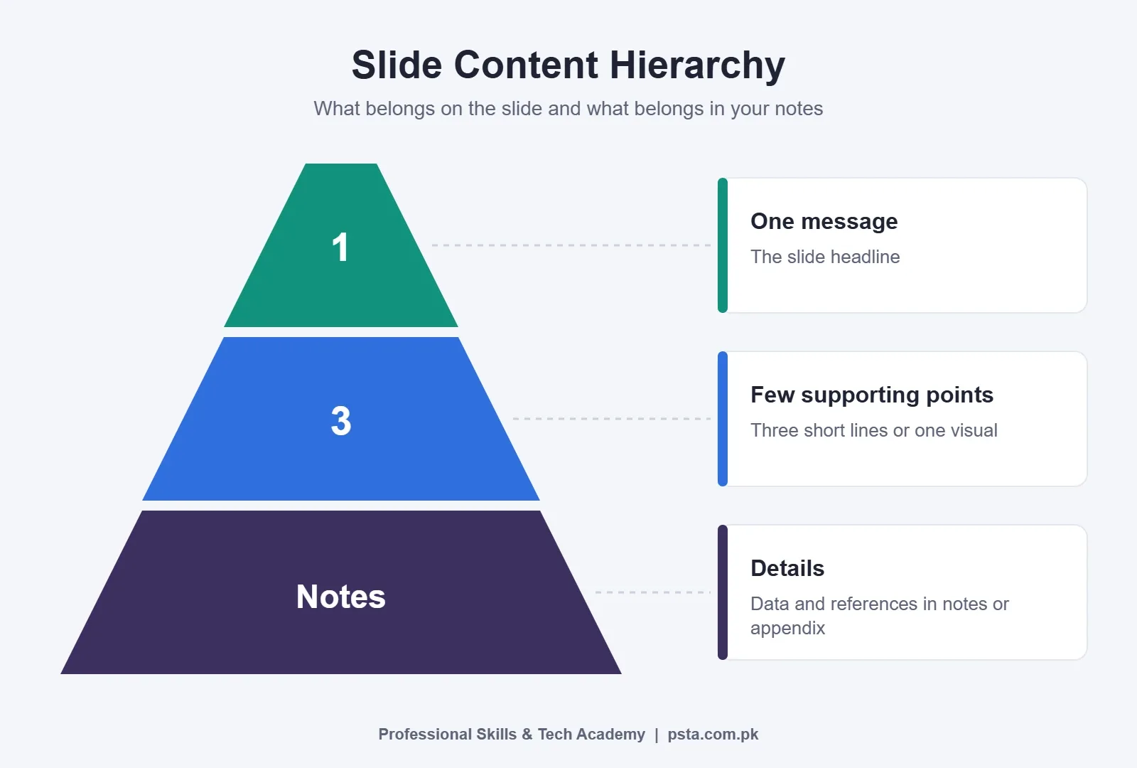
Think of each slide as a small pyramid. At the top sits one message. Below it, a few supporting points. At the base, the details, data and references, which live in your notes or appendix slides instead of the main view.
Is Reading Off Your Slides Really So Bad?
Of all the delivery-related PowerPoint presentation mistakes, this one is the most visible. Mistake 7 is turning your back to the audience and reading the screen aloud. It tells the panel you do not know the material without help. It also kills eye contact, which matters a lot in interviews and defenses.
Presenter View solves much of this. Microsoft's guide to using Presenter View explains that you turn it on from the Slide Show tab. Your screen then shows the current slide, the next slide, your notes and a timer, while the projector shows only the slide. There is also an option to blank the screen so attention returns to you.
To practice, try Rehearse with Coach. Microsoft's page on Speaker Coach says it gives feedback on pacing, filler words, wordy phrasing and reading slide text. A Rehearsal Report appears when you finish. You need a microphone and an internet connection, and the page says it currently works in English only.
If speaking in English is what makes you read off the slides, the problem is confidence, and it can be trained. Our English Spoken and Grammar course includes practice speaking in interviews and meetings.
Mistakes 8 and 9: Checks You Skipped
Mistake 8: Never Testing on the Real Projector
Technical PowerPoint presentation mistakes usually appear only on the day. Many university halls and office meeting rooms still have older projectors. A widescreen deck shown on a square screen gets black bars, and a deck built in the old shape looks boxed on a modern TV.
Microsoft's page on changing slide size says Widescreen (16:9) is the default for new decks and Standard (4:3) is the older format. You switch from Design, then Slide Size. When shrinking, the Ensure Fit option keeps everything visible but smaller. Decide the size early, because changing it at the last minute can push content around.
Ask the department or office which screen you will use. If you can, visit the room a day before. Check colors, font sizes and any video or sound.
Mistake 9: Forgetting Accessibility
Some people in your audience may have weak eyesight, color blindness or use a screen reader when they open your shared file later. The same Microsoft accessibility guide recommends alt text on pictures, charts and shapes, a unique title on every slide, and not relying on color alone.
The Accessibility Checker finds many of these issues for you. Open it from Review, then Check Accessibility. Microsoft notes it can miss some contrast problems, so still look at each slide with your own eyes.
Mistake 10: Arriving With One Fragile File
Here is an example: the deck opens on the department PC and your special font has turned into something plain and misaligned. Or the USB will not open at all.
Embedding fonts protects your design. Microsoft's guide to embedding a font lists the path as File, Options, Save, then ticking "Embed fonts in the file." Using common fonts such as Arial or Calibri also lowers the risk.
Always carry a backup PDF. The Microsoft guide to saving a presentation as PDF shows the route through File, then Export, then the PDF/XPS option, and Publish. A PDF freezes your layout, so plan for animations and videos to be missing in it. Keep copies in two places, such as a USB drive and your email or cloud storage.
PowerPoint Presentation Mistakes at a Glance
This table gathers all 10 PowerPoint presentation mistakes in one place. Use it as a final check before you send or present your deck.
| Mistake | What the audience sees | Fix |
|---|---|---|
| Too much text | A wall of words they read instead of listening | One message per slide; details in speaker notes |
| Tiny fonts and low contrast | Faded, unreadable lines from the back rows | 18pt or larger, sans serif, strong contrast |
| Inconsistent fonts and colors | A deck that looks stitched together | Set styles once in the Slide Master; try Designer |
| Heavy animations and transitions | Motion that pulls attention from the point | One subtle transition; animate only real sequences |
| Poor charts | Tiny labels, too many colors, no clear meaning | Takeaway as title; highlight one series |
| No numbers or structure | No way to refer back; no sense of progress | Slide numbers, agenda and summary slide |
| Reading off slides | Your back, little eye contact, low confidence | Presenter View with notes; Rehearse with Coach |
| Untested projector | Black bars, cut content, washed-out colors | Choose 16:9 or 4:3 early; test in the room |
| Missing accessibility | Images with no description, untitled slides | Alt text, slide titles, Accessibility Checker |
| Fragile file, no backup | Swapped fonts, a deck that will not open | Embed fonts; carry a PDF in two places |
A Simple Prep Workflow Before Presentation Day
Most of these slide design tips only work if you leave time for them. Here is a routine that fits an FYP presentation, a class talk or a monthly office report.
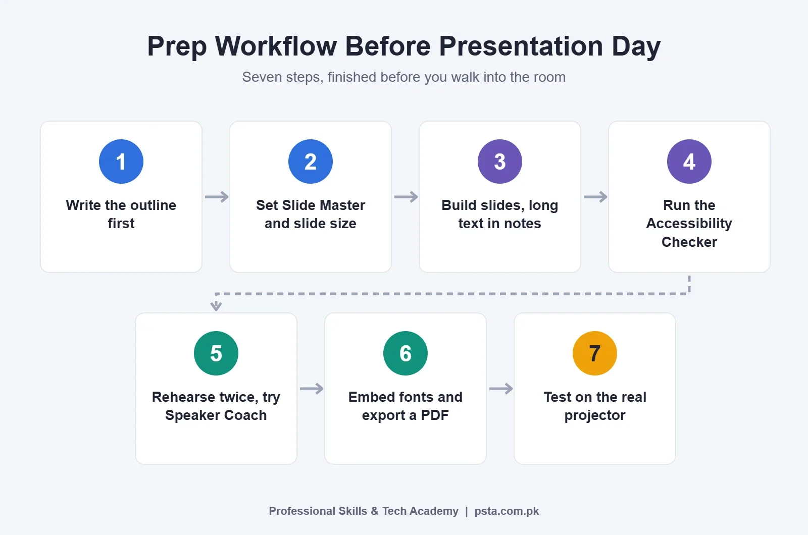
- Write your outline first, in a notebook or Word, with one sentence per slide.
- Set fonts, colors and slide size in the Slide Master before adding content.
- Build the slides, keeping long explanations in the notes area.
- Run the Accessibility Checker and fix what it reports.
- Rehearse aloud at least twice, once with Speaker Coach if it is available to you.
- Embed fonts, save the final version and export a backup PDF.
- Test both files on the actual projector or meeting room screen.
Take a hypothetical student whose defense is on Thursday. Finishing the slides by Monday leaves Tuesday for rehearsal and Wednesday for the room test. That small buffer removes most last-minute panic.
Where Office Automation Training Fits In
If you want guided practice instead of trial and error, the Office Automation course at PSTA covers PowerPoint, including clean slide design, transitions and presenting. It also teaches Word for letters and CVs, Excel for tables, formulas and charts, plus computer basics, file management and English and Urdu typing.
The course runs for 12 weeks at a Beginner level. It currently costs Rs. 12,000 instead of the regular Rs. 15,000, and you can pay in two installments. Umar Qureshi teaches the class, and any employer can check your PSTA certificate online.
If you want a broader foundation for a computer career, the Diploma in Information Technology (DIT) is a one-year option. You can compare every program on the courses page.
Sessions run in person at the Mandian campus (Old College Road, across from FIMS College) and live online for learners outside Abbottabad, and some students combine the two. Each month a new group starts, with time slots from morning to evening, Monday to Saturday. For a timing that fits your schedule, send a message on WhatsApp and the team will reply with current options.
Start With Your Next Deck's Title Slide
Open the last presentation you made and pick its most crowded slide. Rewrite the title as one clear message, keep only three supporting lines, and move the rest into the notes. That single edit shows you how most PowerPoint presentation mistakes can be fixed in minutes. When you are ready for structured practice, the admission page explains how to enroll.
Frequently asked questions
How many slides should a 10-minute FYP defense have?
There is no fixed rule, so check your department's guidelines first. As a practical habit, plan roughly one slide per minute of speaking, plus a title slide and a summary. If you find yourself rushing through slides, you have too many. Move extra detail into backup slides at the end, which you can open only if an examiner asks.
Is it okay to use Urdu text on my PowerPoint slides?
Yes, if your audience and institution expect it. Choose a clear Urdu font, keep the size large, and test the file on the presentation computer, because a missing Urdu font can break the layout badly. Embedding fonts and keeping a PDF backup protects you if that computer lacks the font you used.
Do I need Microsoft 365 to use Designer and Speaker Coach?
According to Microsoft's help pages, Designer on the desktop needs a Microsoft 365 subscription, while PowerPoint for the web offers design suggestions to everyone. Speaker Coach is described as a free preview available in the web version as well. Both need an internet connection, and Speaker Coach also needs a working microphone.
What should I put in the speaker notes?
Use the notes box for the explanation you would otherwise paste onto the slide. Write key numbers, names you might forget, a short transition line to the next slide and any reference an examiner may ask about. Keep it in short phrases so you can glance at it in Presenter View without losing eye contact for long.
Should I send my office report as a PPTX or a PDF?
Send the PDF when people only need to read the report, since it keeps your layout fixed and opens on almost any device. Send the PPTX when colleagues need to edit slides or reuse charts. Many offices appreciate both, with the PDF as the main attachment and the editable file shared on request.
How do I stop feeling nervous during a presentation?
Preparation is the most reliable remedy. Rehearse aloud several times, ideally standing up and timing yourself, and practice the first minute until it feels natural. Arrive early to test the room. If English fluency worries you, regular spoken practice in a structured class builds comfort faster than practicing alone.
Can I change slide size after finishing my deck?
You can, but it may shift or shrink your content, so you will need to recheck every slide. PowerPoint offers options to maximize or fit content when scaling. It is far easier to ask which screen you will use and set the slide size before you build anything, then design with that shape in mind.
Sources & references
- Rehearse your slide show with Speaker Coach support.microsoft.com
- Embed a font in a presentation support.microsoft.com
- Create professional slide layouts with Designer in PowerPoint support.microsoft.com
- Make your PowerPoint presentations accessible to people with disabilities support.microsoft.com
- Change the size of your slides support.microsoft.com
- Use Presenter View in PowerPoint support.microsoft.com
- What is a slide master in PowerPoint? support.microsoft.com
- Save PowerPoint presentations as PDF files support.microsoft.com
Last reviewed & updated on by Umar Qureshi. Written by the PSTA team in Abbottabad, Pakistan.

Umar Qureshi

Certified Office Automation Course: Master MS Office & Computer Basics
Turn this guide into a career: hands-on training with real projects, online across Pakistan or on-campus in Abbottabad · 12 Weeks.

Comments
No comments yet — ask a question or share your experience.