Quick answer
A brand style guide is a short document that tells anyone using a brand which logo versions, colors, fonts, voice and images are allowed. Build it in seven steps, list HEX, RGB and CMYK codes, check text contrast against WCAG ratios, record font licenses and hand over a folder of ready files.
Key takeaways
- • Most small brands need six sections: logo, colors, type, voice, imagery and specs.
- • List HEX, RGB and CMYK codes so web, video and print teams match.
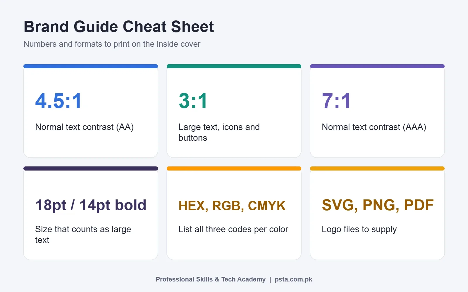
- • Text needs a 4.5:1 contrast ratio, or 3:1 when it is large.
- • OFL fonts can be used in logos and print without extra permission.
- • Deliver the PDF with a folder of SVG, PNG and PDF logo files and templates.
Table of contents 17 sections
- What Goes Inside a Brand Style Guide?
- Brand Guidelines vs a Logo File: Why Clients Need Both
- How to Create a Brand Style Guide in 7 Steps
- Step 1: Write the Brand Basics on One Page
- Step 2: Lock Down the Logo Versions
- Step 3: Build the Color Palette With Exact Codes
- Check Contrast Before You Finalize
- Step 4: Choose Two Fonts and Set a Type Scale
- Step 5: Describe the Brand Voice
- Step 6: Set Image and Illustration Rules
- Step 7: Add Specs, Templates and Hand It Over
- Worked Example: Brand Rules for a Small Bakery
- Which Tools Should You Use to Build It?
- Common Mistakes That Make Guides Useless
- Should You Sell Brand Guidelines as a Freelancer?
- Building Brand Identity Kits in PSTA's Graphic Design Course
- Draft a One-Page Guide for a Shop Near You
Why does a client's Facebook post look one way, their shop board another, and their visiting card a third, even though the same logo sits on all three? Design students in Pakistan ask some version of this question in almost every branding class. The usual answer is that nobody wrote the rules down. A brand style guide fixes that.
A brand style guide is a short document that tells anyone working on a brand which logo files, colors, fonts, words and images to use, and how. This guide walks you through building one from scratch, the way a freelancer would for a real small business.
- The six sections almost every guide needs, and which extras can wait
- Seven steps to build a guide in Illustrator, Canva or Figma
- Accessibility numbers worth putting on the color page
- A worked example for a local bakery, with sample rules
- A handover checklist you can reuse with every client
What Goes Inside a Brand Style Guide?
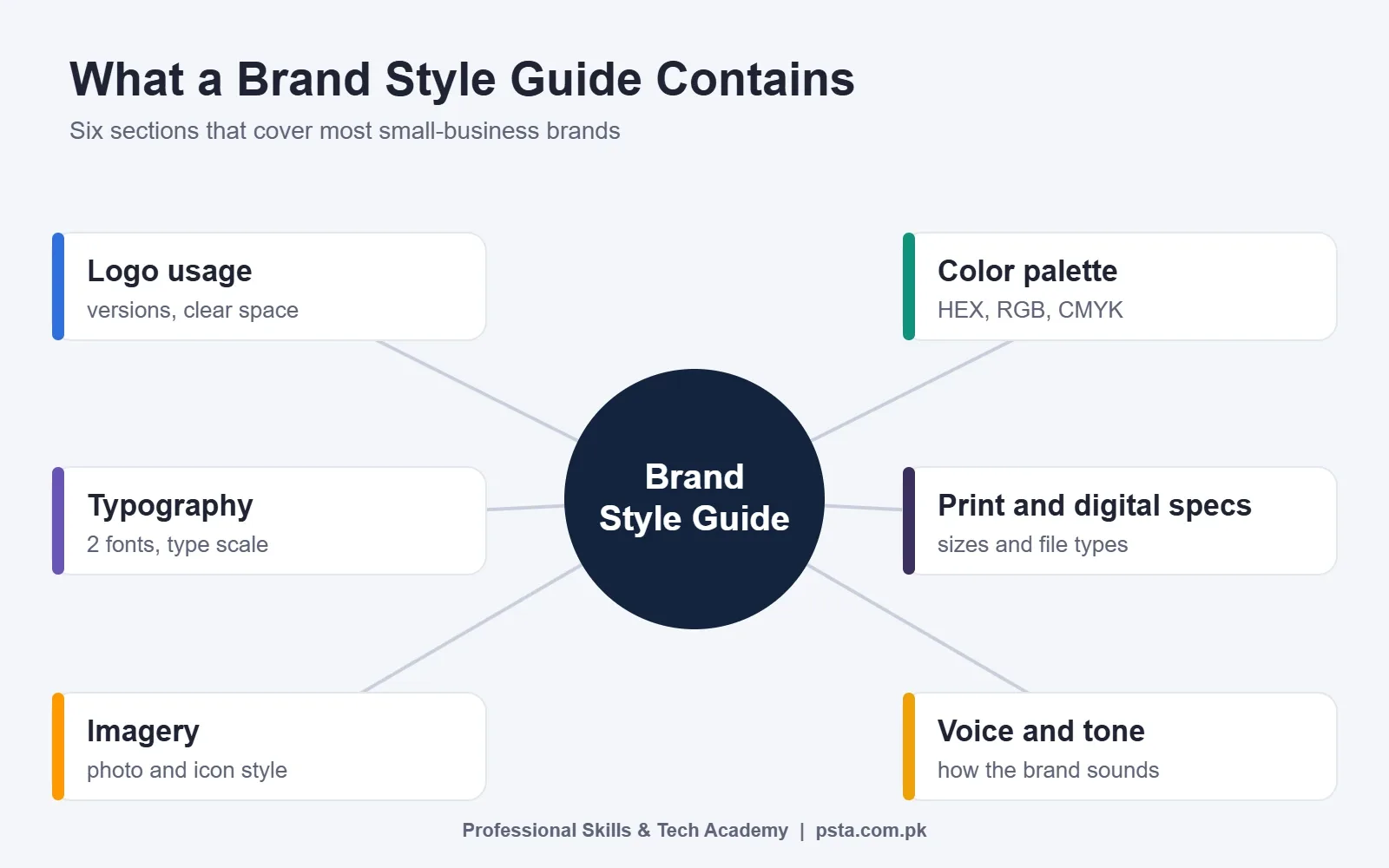
Different agencies use different names, but the contents overlap heavily. The Fiverr guide to brand style guides names five core elements: logo guidelines, a core color palette, typography, voice and imagery. VistaPrint's brand guide article adds print and digital specifications as a sixth section.
That gives you a sensible skeleton for most small clients:
- Logo usage rules: versions, minimum size, clear space and misuse examples.
- Color palette: primary and secondary colors with exact codes.
- Typography: heading font, body font and how big each should be.
- Voice and tone: how the brand sounds in captions, replies and ads.
- Imagery: what photos and illustrations should look like.
- Print and digital specs: sizes and file types for common jobs.
Bigger brands add packaging, signage, website layouts and social media templates. Leave those for later unless the client already needs them. A tight ten-page guide that people actually open beats a 60-page PDF nobody reads.
Brand Guidelines vs a Logo File: Why Clients Need Both
Many clients in Pakistan buy a logo, receive a single PNG on WhatsApp and stop there. Six months later the logo is stretched on a panaflex, recolored by a printer and squeezed onto a dark Instagram post where it disappears.
A logo is an asset. Brand guidelines are the instructions for using it. When you deliver both, the client can hire a new printer, a social media manager or a web developer without losing consistency. For you as a freelancer, the guide is also proof of professional work that sits well in a portfolio.
How to Create a Brand Style Guide in 7 Steps
Work through these in order. Each step feeds the next, so skipping ahead usually means redoing pages.
Step 1: Write the Brand Basics on One Page
Before you open any design software, sit with the client for 30 minutes. Write down who the business serves, what it sells, the city or region, the main competitors and three words that should describe the brand. The Fiverr guide calls this layer brand identity, and lists story, mission, vision, voice, values and target audience as its parts.
Keep it short. One page with plain sentences is enough for a small business. This page decides every later choice, from colors to caption style.
Step 2: Lock Down the Logo Versions
Export every version the client will need:
- Full-color logo on a light background
- Reversed (white) logo for dark backgrounds
- Single-color version for stamps, embroidery and one-color printing
- A compact icon or mark for profile pictures and favicons
Then set three rules. First, a clear space around the logo where nothing else may sit. A common method is to use a part of the logo itself as the unit. The Fiverr guide gives Spotify as an example, where the exclusion zone equals half the height of its icon. Second, a minimum size so the logo stays readable. Third, a short "do not" list with pictures: no stretching, no new colors, no shadows, no busy photo backgrounds.
Step 3: Build the Color Palette With Exact Codes
Pick one or two primary colors, two or three secondary colors and a neutral pair for text and backgrounds. For each color, list:
- HEX for websites and social media tools such as Canva
- RGB for screens and video
- CMYK for offset and digital printing
Printers in Pakistan often work from CMYK files, so never send them only a HEX code. If you need a refresher on why screen and print colors differ, read our RGB vs CMYK guide.
Check Contrast Before You Finalize
A beautiful palette fails if people cannot read text on it. The W3C's guidance on WCAG contrast (minimum) sets a ratio of at least 4.5:1 for normal text and 3:1 for large text. It treats 18 point regular or 14 point bold as large. WebAIM's contrast article adds the stricter AAA levels, 7:1 for normal text and 4.5:1 for large text, and notes that buttons and icons need at least 3:1 against nearby colors.
One useful detail: the W3C page says logos and brand names themselves are exempt from the text contrast rule. Your headings, captions and website text are not. Add an approved pairs table to the color page, showing which text color may sit on which background.
Step 4: Choose Two Fonts and Set a Type Scale
Most small brands need only two typefaces: one for headings and one for body text. If the client prints Urdu material, add an approved Urdu font as well, because many local posters and menus are bilingual.
Check the license before you commit. The SIL Open Font License FAQ says no additional license or permission is needed to use OFL fonts in logos, posters, business cards and stationery. Paid fonts are a different matter, so record the license for every font in the guide.
Then write a simple type scale. For example: main heading 36 px, subheading 24 px, body 16 px, caption 13 px for the web, with matching point sizes for print. Add line spacing and when to use bold. These numbers are an example to adapt, not a standard.
Step 5: Describe the Brand Voice
Voice is how the brand sounds. A school might be warm and clear. A mobile repair shop might be quick and practical. Write three "we are" and three "we are not" lines, then add sample sentences. Include the languages the brand uses, such as English, Urdu or Roman Urdu, and when each one is appropriate.
| Situation | On-brand example | Off-brand example |
|---|---|---|
| Instagram caption | Fresh bread at 7 am, every day. Come early. | BEST BREAD IN PAKISTAN GUARANTEED |
| Reply to a complaint | Sorry about this. Please send your order number and we will fix it today. | Not our fault, check your order again. |
| Sale post | Rs. 100 off cakes this Friday only. | Mega crazy sale, hurry hurry |
Step 6: Set Image and Illustration Rules
Decide what photos should look like: natural light or studio, people or products, warm or cool editing. Show four approved sample images and two rejected ones. If the brand uses icons or illustrations, specify line weight and corner style so new graphics match old ones.
Step 7: Add Specs, Templates and Hand It Over
Finish with a page of ready sizes for the jobs the client repeats most, such as a visiting card, letterhead, social media post and story. Our guides to social media post sizes and visiting card size list current dimensions you can copy into this page.
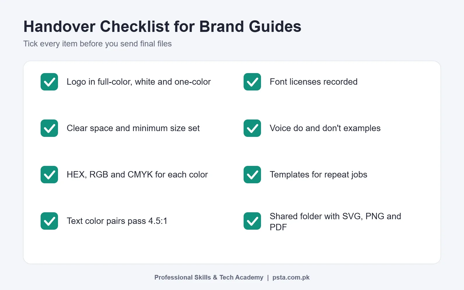
Export the guide as a PDF, and supply a shared folder with logo files in SVG, PNG and PDF formats, font files or download links, and editable templates. Name files clearly, for example bakery-logo-white.png.
Worked Example: Brand Rules for a Small Bakery
The bakery below is invented for teaching purposes. Imagine a family bakery in Abbottabad that wants consistent posts, boxes and a new shop board.
- Basics: serves families and students; three words are fresh, homely and reliable.
- Logo: full-color, white and one-color versions; clear space equal to the height of the "B" in the wordmark.
- Colors: a warm brown primary, a cream background and a deep green accent, each with HEX, RGB and CMYK codes, plus an approved text pairs table.
- Type: one rounded sans-serif for headings, one plain sans-serif for body text, and one Urdu font for price lists.
- Voice: short, friendly English captions with Urdu on printed menus.
- Specs: box sticker, Instagram post, story and menu card templates.
The whole guide fits in about ten pages. When the bakery hires a new social media helper, they get the PDF and the templates folder on day one. That single handover is where a guide pays for itself.
Which Tools Should You Use to Build It?
Use whatever you design in daily. Illustrator suits logo-heavy pages and exact vector exports. Canva is quick for clients who will edit templates themselves. Figma works well when the guide must sit next to website designs. If you are still choosing software, see our graphic design software guide for beginners.
The tool matters less than the structure. A clean grid, numbered pages and a contents page make any guide easier to use.
Common Mistakes That Make Guides Useless
- Only HEX codes. Printers need CMYK, and video editors need RGB.
- No misuse examples. People follow pictures faster than paragraphs.
- Too many fonts. Four or five fonts usually means no real system.
- No file folder. A PDF without the actual logo files sends people back to screenshots.
- Unchecked contrast. Light gray text on white may look elegant but fails the 4.5:1 rule.
Should You Sell Brand Guidelines as a Freelancer?
Brand style guides are a recognized service on freelance platforms. Fiverr runs a dedicated hiring page for brand style guide designers, and the profiles there often bundle it with logo design, stationery and packaging work. That makes it a natural add-on for a logo order and a practical service to offer in graphic design freelancing.
Pricing varies widely by market and scope, so build your own rate from your hours, and start with a compact package: logo rules, colors, type and one page of templates. Check our graphic design portfolio mistakes guide before you publish case studies.
Building Brand Identity Kits in PSTA's Graphic Design Course
PSTA's Ultimate Graphic Designing course is a 12-week, beginner-level program. Week 9 is set aside for branding projects, including a logo, an identity kit and presentations, and a listed project asks you to present a logo, palette, business card and letterhead together in mockups.
You also work in Photoshop, Illustrator, CorelDRAW, Canva and InPage, which covers both screen and Urdu print jobs. The fee is Rs. 18,000 against a regular Rs. 20,000, paid in 2 installments. You can study in person at PSTA, which sits opposite FIMS College on Old College Road in Mandian, join live online sessions, or mix both. If brand work leads you toward ads and content, the Social Media Marketing and Meta Ads course is a sensible next step.
See every program on the courses page, reserve a seat through admission, or message +92 314 5424399 on WhatsApp to ask which batch suits your timetable.
Draft a One-Page Guide for a Shop Near You
Pick a local shop whose logo you see often. On a single page, write its three brand words, sample two colors from its board with a color picker, name the fonts you think fit, and draw one "do" and one "don't" for the logo. It takes about an hour and gives you a portfolio piece that explains your design decisions.
Frequently asked questions
What is a brand style guide?
A brand style guide is a document that sets the rules for using a brand. It covers logo versions and spacing, exact color codes, approved fonts, the tone of written content, image style and common file sizes. Its job is to keep posts, prints and signs consistent, whoever designs them.
How many pages should a brand style guide have?
There is no fixed length. For a small business, about ten clear pages usually cover logo rules, colors, fonts, voice, imagery and specs. Larger companies add packaging, signage and web layouts. A short guide that people actually read is more useful than a long one nobody opens.
What is the difference between a brand style guide and brand identity?
Brand identity is the overall character of a business: its story, mission, values, audience and look. A brand style guide is the practical rulebook that turns that identity into instructions, such as which logo file to use on a dark background or which color code a printer should follow.
Which color codes should a brand style guide include?
Include HEX codes for websites and design apps, RGB values for screens and video, and CMYK values for printing. Many printers work from CMYK files, so giving them only a HEX code can lead to colors that look different on paper than on screen.
Can I use Google Fonts or other free fonts in a client logo?
Fonts released under the SIL Open Font License can be used in logos, posters, business cards and stationery without extra permission, according to the official OFL FAQ. Other free fonts may have different terms, so check each license and record it in the guide before you deliver.
Which software is best for making a brand style guide?
Use the tool you already know well. Illustrator suits vector-heavy logo pages, Canva is convenient when clients will edit templates themselves, and Figma works well for guides that sit alongside website designs. Structure, clear examples and a tidy file folder matter more than the software.
Sources & references
- What Is a Brand Style Guide, Fiverr fiverr.com
- How to Create a Brand Style Guide, VistaPrint vistaprint.com
- Understanding SC 1.4.3 Contrast (Minimum), W3C w3c.github.io
- Contrast and Color Accessibility, WebAIM webaim.org
- OFL FAQ, SIL Open Font License openfontlicense.org
- Hire Brand Style Guide Designers, Fiverr block.fiverr.com
Last reviewed & updated on by Umar Qureshi. Written by the PSTA team in Abbottabad, Pakistan.

Umar Qureshi

Ultimate Graphic Designing Course in Pakistan: Master Photoshop, Illustrator, CorelDRAW & AI Tools (Practical & Beginner Friendly)
Turn this guide into a career: hands-on training with real projects, online across Pakistan or on-campus in Abbottabad · 12 Weeks.

Comments
No comments yet — ask a question or share your experience.